Terms you Should Understand
- Horizon Line In visual art, the terms "horizon line" and "eye level" are often used synonymously. Horizon line/eye level refers to a physical/visible boundary where the sky separates from land or water. The horizon line is also a significant component of perspective. It is the height of the viewer's eyes when looking at an object, interior scene, or exterior scene.
- Major Flow When discussing the Flow of a design, painting, sculpture, etc., we are talking about the major direction dominating the all-over design. For example, the all-over Flow in a design may be diagonal (or vertical or horizontal)
The Rule of Thirds, often discussed in photography, is a great design tool for the visual arts. In the Rule of Thirds, the main subject is not placed in the center of the composition, but on one of the sweet spots. When handled correctly, design often looks more dynamic.
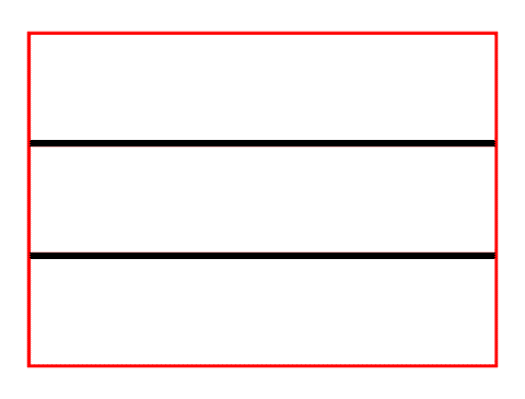
 The picture plane show above, is divided into thirds, vertically and horizontally. The areas where the vertical and horizontal lines overlap are called the “sweet spots.” (image below). Sweet spots are where you place areas of interest, including the focal point and an accent or two. For more on focal points, please read that blog.

What isn't the Rule of Thirds!
The example below shows a photo not using the Rule of Thirds. The focal point, the sailboat, is not on a sweet spot. Also, the horizon line is dead center on the picture plane.

It's a lovely photo, but not an example of the Rule of Thirds.
Correct use of the Rule of Thirds
Let's use the same photo an apply to the Rule of Thirds, so to get the full affect of this principle of design.
The sailboat is neatly placed on the top of the left sweet spot. You will get a different feeling depending on where you place the horizon on the picture plane. The horizon line is on the top two sweet spots, running along the top vertical line. This creates an emphasis on the water rather than the sky.

Below is another example of the correct use of the Rule of Thirds. In this case, the emphasis is on the sky. The shift of the horizon line creates a different feel using the same photo.

I often use the Rule of Thirds in my work. I suggest:
- The picture plane divided vertically or horizontally, using a vertical or horizontal “line” as the main emphasis. Sometimes I use both.
- Don’t use all four sweet spots. Remember the Rule of Odds: odd numbers of items are more pleasing on an unconscious level. Using all four sweet spots runs the risk of the composition becoming stagnate.
When I emphasize the horizontal lines, I must first designate the horizon. It recommend you think beyond the technical definition of the horizontal line.

In the photo below, the horizon line is in the bottom third grid line, creating a emphisis on the sky.

In the photo below, the horizon line is placed on the top horizon grid line, emphasizing the foreground.

You can also divide the picture plane vertically at the 1/3 marks and place important elements on those grid lines.

In this wonderful photo, the industrious ant, with its treats, is on the right vertical line of the grid. Notice that there are no horizon lines, as seen in the first examples. Sometimes you can't find a horizon line, or the horizon line is so vague that it feels nonexistent. Using the grid and a loose definition of "horizon," you can still make the Rule of Thirds concept work.

Humans are unconsciously drawn to faces, and the eyes are an essential feature of the face. Having an eye on the sweet spot is a nice touch.

The photo below uses a vertical and horizontal line on the grid. This may appear causal, but it takes careful consideration when using the Rule of Thirds.
- The figure on the right is closer to the view, so it looks taller than the figure on the left.
- The major Flow on the picture plane is diagonal. A diagonal flows are dynamic. Read the blog on Expressive Lines, Shapes and Forms for more on the concept.
The composition would not be as successful if both figures were on vertical lines but at the same height. The major Flow would no longer be diagonal if both figures were the same height.

More examples of using the vertical and horizontal lines.


Photo by Aleksandra Boguslawska, unsplash.com

