To make this meaningful, please read the two posts on Expressive Lines, Shapes, and Forms. They will establish the "rules" of understanding the energy levels and unconscious visual cues provided by lines, shapes, and forms.
Remember, you need to understand the rules to break them, which people often call "working outside of the box." Let's start by looking at an example that complies (mostly) with the rules.

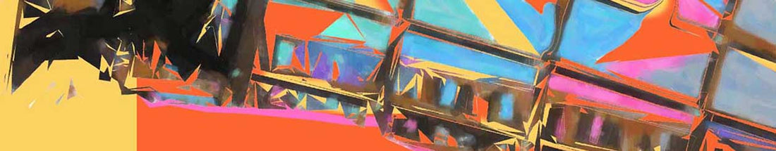
Hyena Stomp, by Frank Stella, 1962. Tate Modern
The painting Hyena Stomp, by Frank Stella, has a strong, man-made presence. I say this because:
- It is made of geometric shapes
- It uses outline rather than organic lines
- The paint is applied so smoothly that there are no signs of brush marks, even on close inspection.
This is a huge painting that was created in 1962. At first glance, it appears to have been made on a computer, not by hand.
When considering the energy level of Hyena Stomp, the squares' orientation is medium-low energy, but there are additional design elements to consider.
The color and value contrasts are critical to the energy level and movement. The well-thought-out placement of the warm and cool colors helps create intense eye movement (color contrast).
The use of white lines separating the segments of colors, especially against the darker values of the blues and greens, assists in movement (value contrast). Using color and value contrasts raises the energy level from medium to medium-high.
The unity of the squares' placement produces a repetition with a steady rhythm. This rhythm adds to the movement and energy level/
So, in summary, Hyena Stomp is man-made due to the main shapes, the type of line, and the painting style. Squares in this orientation typically have lower than medium energy levels. Still, I assess the energy level of this piece as medium-high based on color contrast, value contrast, and the unity of placement.
Let's compare the piece Harmony II by John Douglas.

Harmony II, by John Douglas
Ask yourself the following:
- Is the piece mainly man-made or organic? Note: Look at the line quality to help you assess this question.
- What are the main 1 or 2 shapes?
- Based on the main shapes, what is the energy level?
- Are the negative/positive space, color, and value used adding or taking away for the energy level of the shapes? (The more knowledgeable you are of design principles, the easier it is to make these assessments.)
Like Stella's painting, Harmony II has a strong geometric presence, using squares and a unified layout, producing an orientation with a medium-low energy level.
Unlike Stella's painting, this piece is mainly organic, based mainly on the line quality and texture. Hyena Stomp has a smooth, crisp application of paint, but in Harmony II, you can see man's hand in its creation. Although laid out in a grid, it lacks Stella's painting's crisp, clean edges, giving a softer, organic feel.
Additional contributors to the energy level are the primary colors, value contrast, and various textures used. In this case, there is a limited color palette, which creates unity but reduces overall energy. There are some areas of high contrast, but they do not dominate the piece (this piece uses a medium Key value). The areas of contrast gently direct the eye throughout the work. The texture also contributes to the visual movement in the piece. By varying the types of surfaces in each square, the artist creates an additional level of visual movement.
To summarize, Stella's painting Hyena Stomp is man-made based on primary geometric forms, paint application, and line quality. By the rules, squares placed in this orientation have a lower than medium energy level. In this case, the Hyena Stomp has a higher energy level based on color contrast, value contrast, triangles, and unity of the placement of the shapes.
Douglas's piece, Harmony II, is organic by nature. I base this on the line quality, texture, and the value dominating the work. The energy level is more traditional (to a square) due to the color palette (lacking color contrast), the use of a grid, and the gentle value used (a key).
In the next post, I will examine the circle. The circle is considered both man-made and organic. I will apply the same information used in this blog to the circle.